For the general population, the USA flag may be an iconic one. Everyone takes pride in the design and honours it well. Not just the USA flag, but also that of other countries like Turkey and UK. But if you really dig deeper, do you think it’s up to the flag standards? Not many people give thought to what makes a particular flag better than the other national standards across the globe. Vexillologists often study the domain of flags and how to improve them.
Vexillologists agree that there are some clear cut rules about flag designs which make particular flags, clear winners and leaving others behind. Since national flag is what represents an entire nation, it is absolutely essential that the flag is crafted beautifully, yet simplistically. There are some principles given by vexillologists mentioned below to make the concept clear and to make a distinction between a good and a bad flag.
Principles of Flag Designing:
First things first, it is integral to keep a flag simple with a minimalist design. The purpose of the flag is to be read from a distance, not be so complicated with arms, seals and confusing range of colours. In order for the flag to be remembered and celebrated, it is important to keep the design and overall look of the flag, simple and appealing. Consider this - a flag should be so simple, that a child can draw it using his own memory.
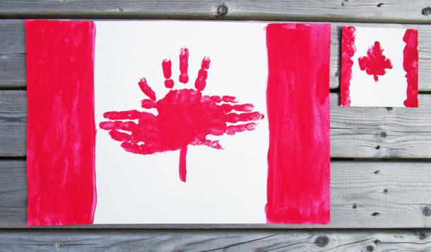
Secondly, using meaningful symbolism is essential. The meaning behind colors, patterns and symbols on the flag are a crucial element of the flag. To add significance to the nation or the institution that the flag represents, a designer could add lines, colors as well the charges if required. Charges mean geometric shapes or symbols on the flag. These are graphic elements from a larger design, but hold immense importance in a single shape. A perfect example for this would be that of the Maple Leaf of Canadian flag. You can easily picture it as it is clear and concrete.
Thirdly, using two to three basic colors should be enough. The color palette should be coherent and restricted to only a few colors. More specifically, an ideal flag should not consist of more than three primary colors. The basic flag colors include,
- Red
- Blue
- Yellow
- Green
- Black
- White
A mix of these colors should make a flag look coherently designed. The colors you select, will also impact the visibility of your flag. The essential key here is contrast, which will allow your flag to seem vibrant, yet recognizable from afar. This way, even if the flag is designed in black and white colour, it will not lose its meaning completely.
Fourthly, be mindful of the fact that there should be no lettering or seal on the flag. There should never be any kind of writing or organization seal on the flag. Moreover, a successful flag always negates this domain entirely. Since words and letters get blur and lose meaning at a distance, it becomes meaningless to put them on the flag.
Finally, ensuring your flag is unique is very important too. You are allowed to take elements or ideas from other flags in order to make your flag related, however the flag should not be so similar that there is no distinction left at all. Your flag should be solely recognized for a particular nation only. Most of the African states use green, gold as well as red colors. Most of them use vertically and horizontally too, to change the order, to make their flag seem innovative.
There are flags which have complicated designs, yet look appealing, however there are some which just do not hit the mark. Below are some examples.
1. Simple and Striking Design of the Flag of Ukraine

2. Complicated, But the Most Detailed Flag of Turkmenistan

3. Complicated, Yet Effective Flag Design of Sri Lanka

4. No Proper Context and A Logo-Like Design of the Flag of Kyrgyzstan

On a concluding note, flags are vital to get a distinct identity in the global platform. These are significant because they represent various nations and are flown on various global events like the Olympics, where people from different nations participate. Flag designers are often overshadowed or overlooked, but they are the backend workers who make the flags different and recognisable in a crowd of millions. Though a flag could be designed according to your own preference, making it ‘cool’, but a simple flag will only work towards your own advantage. The unsung heroes, which are the flag designers, often analyze the factors like colors, proportion, symbols and the underlying meaning behind them to make them unique. The careful evaluation can result in an even the most complicated flag seem attractive and remembered by many.
Banner Image Source, Yummymummyclub